
PR-COM presents itself self-confident, open and dynamic
PR-COM, a consulting agency for strategic corporate communications specializing in high-tech markets for more than 30 years, has a new logo.
The old logo was getting on in years and no longer fit the agency’s profile. PR-COM’s expertise still includes traditional PR, but has expanded to include social media, marketing communications, content creation, corporate positioning and coaching. We wanted a logo that reflected PR-COM with its current offerings, but at the same time was open to the future.
With Verena Seyrek, we recently added an experienced art director to our team who has taken on this task. She comes from a corporate design background and knows what it takes to implement this task.
We associate the future primarily with three keywords: openness, curiosity and self-confidence. We are open to new things, curious about what awaits us, and confident that we can master the future. Can that be represented typographically?
“Yes, it can, and it starts with the choice of typeface,” says Verena Seyrek. “We chose Barlow, which we already use on our website. Barlow is a slightly rounded, low-contrast grotesque typeface. For the logo, we developed it further, made it more confident, so it’s wider and more spacious.”
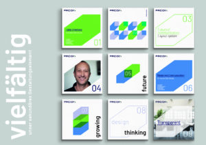
Our graphic designer opened up part of the typeface – just as confidently. But we decided not to change every letter in the logo, because PR-COM also stands for continuity and reliability. In the end, we decided to open up the “M”. To do this, we use one of the diagonals of the letter as a colored variable, pointing from the bottom left to the top right, thus representing both PR-COM’s future-oriented and dynamic attitude and the open company culture with flat hierarchies.
![]()
With the flexibly usable diagonal, we have created a secondary, three-dimensional design element that can be derived from the old logo and used in the design of brochures, websites or flyers – two-dimensional, as an outline or pattern. It is as mobile and flexible as we are.
And the color? We decided on a green because it stands for a future with ambition, so it suits us. In the end, our art director created a wonderful element, one that can be used very flexibly, yet is very clear and recognizable, and which extends PR-COM’s lettering because our mindset has expanded. The logo is now a contemporary, quickly graspable wordmark without formal weaknesses, but with content that fits the company.

“We like the logo because it represents exactly what PR-COM is today,” comments Alain Blaes, founder and CEO of the agency. “And it leaves us room for change. The new wordmark will be with us for a while, but we will continue to develop it. Just as we will do with PR-COM.”